
https://macon.craigslist.org/
Dislike 1
4-Usability catastrophe; imperative to fix
Craigslist is one of the most visited websites in the world.
It does not have any pictures, logos, or banners.
Heuristics #2 Match between system and the real world. The
design does not follow and correspond with natural mapping
Heuristics #7 This website has no flexibility and efficiency
of use- It needs customization so users can navigate through the products.

Dislike 2
3- Major Usability Problem
Great web design but the graphics will slow downloading.
Heuristics # 8 Aesthetic and minimalist design. Making sure
you are keeping the content and visual designed focused on the essentials.
Ensure that the visual elements of the interface support the user’s primary
goals. Don’t let unnecessary elements distract users from information really
needed.

Dislike 3
1-Cosmetic Problem
Color scheme is very unpleasant. The usability and
navigation are fine. Sharp incompatible colors, overloaded side bar. When
scrolling the logos stay on the screen instead of disappearing.
Heuristic #7
Flexibility and efficiency of use provide personalization by tailoring
content, allow for customization so uses can make selections.
Heuristic # 4 Consistency and standards-maintain consistency
with a single product internal and external.
Liked
Heuristic# 4 Consistency and standards
Rate 0=This not a
usability problem
This website is one of my favorites and very user friendly
if falls under all consistency and standard with the ability and easy to use.
This consistency meets customers’ expectations. It follows all guidelines and
platform and industry conventions.

Liked
https://www.travelocity.com/
Heuristic# 4 Consistency and standards
Rate 0=This not a
usability problem
This website is one of my favorites and very user friendly
if falls under all consistency and standard with the ability and easy to use.
This consistency meets customers’ expectations. It follows all guidelines and
platform and industry conventions.

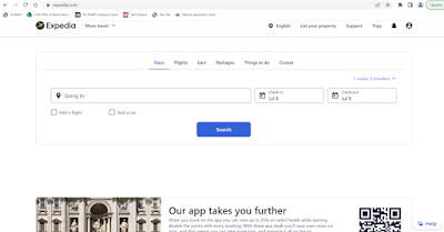
Liked
Heuristic# 4 Consistency and standards
Rate 0=This not a
usability problem
This website is one of my favorites and very user friendly
if falls under all consistency and standard with the ability and easy to use.
This consistency meets customers’ expectations. It follows all guidelines and
platform and industry conventions.


